
A mark born from the science itself.
When a pre-launch biotech needed an identity as bold as its science, Business Boosters went deep — interviewing the team, studying the molecule, and building a brand from the inside out.

When a pre-launch biotech needed an identity as bold as its science, Business Boosters went deep — interviewing the team, studying the molecule, and building a brand from the inside out.

Consano Biologics was a pre-launch biotech with a dispersed team, a long and cumbersome name, and no visual identity to speak of. The science was genuinely novel — a regenerative therapy targeting lumbar sacral radiculopathy with no direct competitor taking the same approach — but nothing about the brand reflected that ambition yet. Leadership needed more than a logo. They needed a foundation: a name that worked, a mark that would be taken seriously by investors and partners, and an identity that could grow with the company for years to come.
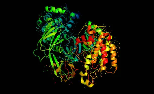
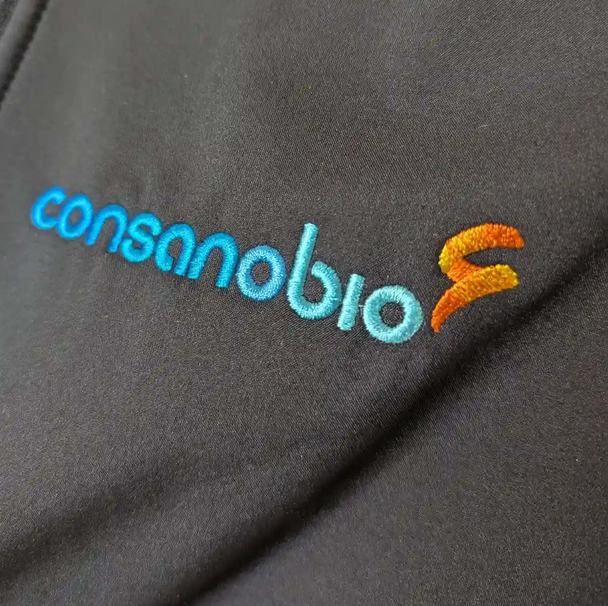
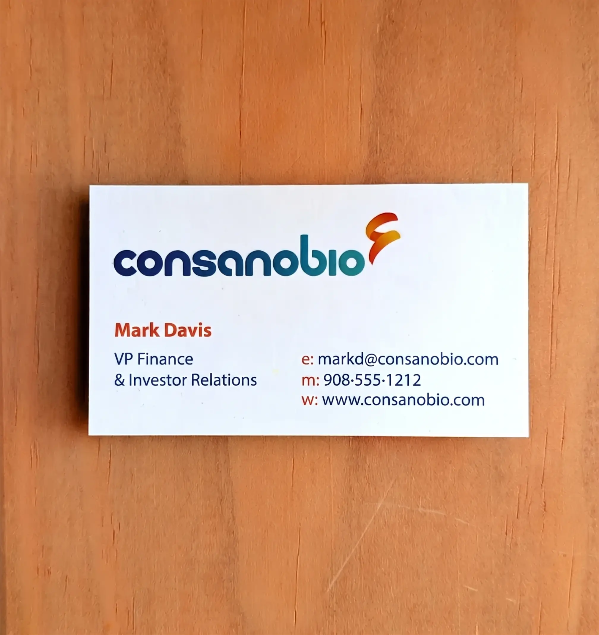
Business Boosters began with deep discovery — a competitive review of the biopharma landscape and one-on-one interviews with eight members of the leadership team. The name "Consano Biologics" was flagged early as cumbersome; the internal decision to consolidate to consanobio opened new creative possibilities. With design criteria defined — modern, timeless, no DNA clichés, no spine imagery — the team ran an extensive ideation session across multiple rounds of candidates. The breakthrough came when the CEO shared the science behind their lead asset: a blood-derived growth factor protein. Its dynamic molecular structure became the visual anchor. The final logotype — lowercase, bold, gradient — draws directly from that protein, with a custom mark that captures both the fluidity of the molecule and the momentum of a company pioneering regenerative medicine.


From a blank page to a complete brand system — logotype, color, typography, brand guide, and collateral — built on the science, shaped by the team, and ready to grow.